Over the last years we have seen an interesting typography trend developing that changed the way we look at design. Now font software has become more accessible to the masses, designers are pushing boundaries in typography and it’s becoming an expressive movement that has found its way into every part of graphic design.
Looking at the business card, its main purpose is sharing your contact details in a way that fits your business and how you want to come across with your potential client.
A cluttered business card with illustrations, icons, photography and unnecessary elements is a thing of the past and typography based business cards are all the rage at the moment. Because a well designed letter is an art piece on its own, going typography based is a great way to keep your business card clean and clear.
So whether you want to have an idea of the possibilities or if you’re looking for a spark of inspiration to design your next business card, we compiled this collection of 54 typographic business cards for you to scroll through. So enough with the talking, let’s have a look at them!
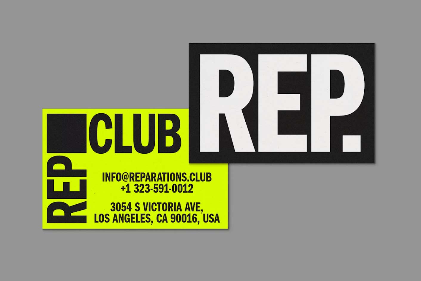
Rep Club
This design with a fluorescent color combined with a black and white color palette works perfectly with this font choice. This Condensed Sans Serif font allows the use of a bigger text size which grabs your attention immediately. This style of design where unnecessary elements are being left out is showing up more and more and definitely sets a certain vibe to it.
Designed by: Estudio Daó
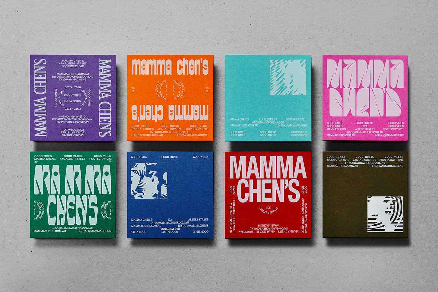
Mamma Chen's
In this set of business cards we can see a bit more elements being used but this fits the overall design aesthetic pretty well. And with all those different elements and colors being used, the main thing that grabs your attention is the variety of typography being used. Most designers are being told at design school that they should work with as few fonts as possible, but it’s clear that the designers at Thought and Found have agreed to disagree on that. And it looks great!
Designed by: Thought & Found
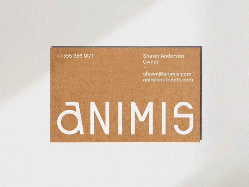
Animis
The use of this display typeface is the perfect example of what good typography can do to your design. When a piece of type gets the attention and the amount of space like we can see on this card, using a typeface with interesting and attention grabbing letterforms will do your business card so much good. And as we can see in this example, 3 groups of text can be enough to make a great design when it’s designed properly. Well done Steve Wolf.
Designed by: Steve Wolf
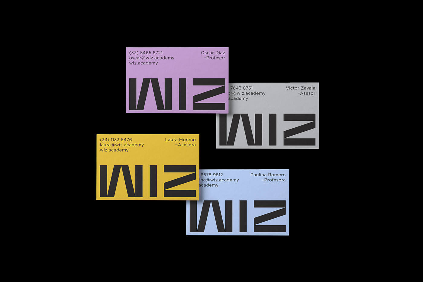
Wiz Academy
A similar composition to the previous card, this design is built around the large sized WIZ piece, set in a geometric display typeface. Based on the design you can already have a sense of how the overall branding would be of this business and that’s a pretty great job to accomplish with the amount of elements.
Designed by: Culto Creative
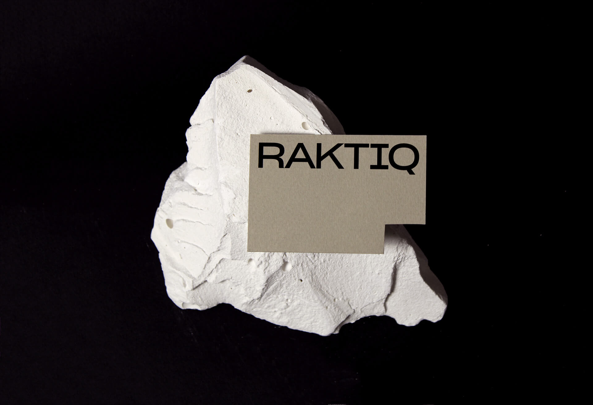
Raktiq
While the shape of the card is based on the white space between the T-I, this card is as minimal as can be and from a designer’s perspective it just looks good. There are many fonts that wouldn’t look good in such a large scale and prominent way but this semi serif typeface (features from both sans serif and serif styles) gives the design a very technical and solid appearance.
Designed by: Ara Estudio
CH-LAB
Again a great example of what a big contrast of font sizes can do. By placing the small elements of text in combination with the large placed typographic logo, there has been a lot more depth added which results in a solid looking card. And the color palette combined with black is spot on as well.
Printed Process: Black Ink printed on Colorplan China White, Forest Green, Mandarin Orange, Factory Yellow, Purple, Turquoise
Designed by: CH-LAB Design Studio
WalkerPrints
Who says text should be set in a straight line from left to right? Letterforms are visuals on their own and can definitely be used that way. By creating a playful composition of separate letters this card definitely grabs your attention.
Designed by: WalkerPrints
L'Atelier
Another way of working with contrast in your designs is by working with different types of font classifications. So instead of keeping your design fully focused on sans serif, why not add an elegant Serif in the mix? Barcelona based studio Velkro did a great job in this as it becomes an interesting combination of elegance and modern.
Designed by: Velkro
Aphrem
By the use of colors, typography and added elements you can tell this brand is all about natural materials and an analogue aesthetic, EPHREM is indeed a manufacturer of wood-fired ovens in France. So the designer did a great job of telling the correct story by the use of design elements. Start exploring with variable fonts yourself so you can adjust the width of certain letters, something that does a lot in the overall look and feel of this card.
Designed by: Antoine Pilette
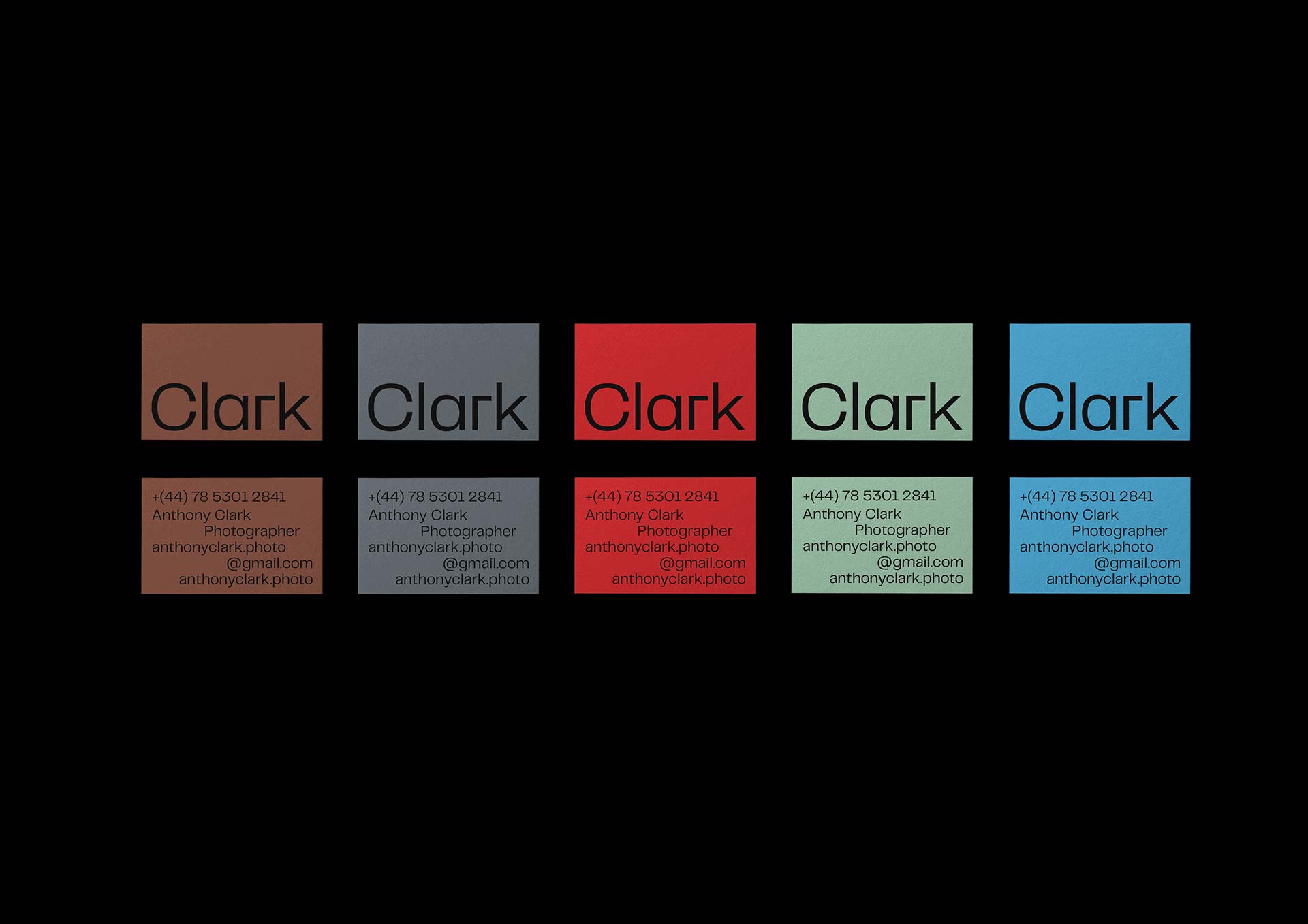
Clark
Already noticing the trend of using 1 ink color and let the stock color do the heavy lifting in terms of color use? While it’s cheaper to produce, somehow in design it makes it look more high-end. So ‘less is more’ is definitely true in this case.
The expressive way of placing text on the backside is a trend we’re seeing more and more lately as well and while it looks random, we can assure you it isn’t. Just another way to do things differently and convey a message of originality.
Designed by: Liam Nguyen
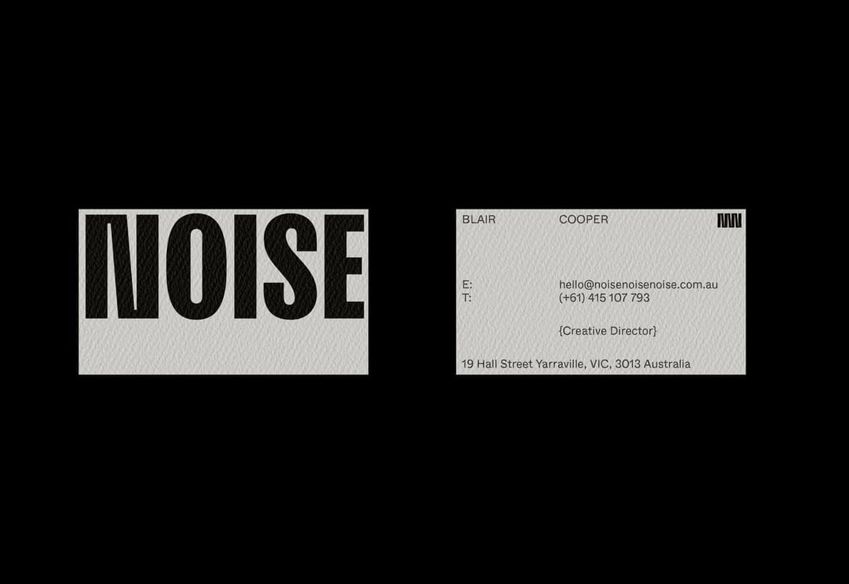
Noise
Another example of what a great display typeface can do to your design. In combination with the sans serif typeface on the backside this really sets the tone for a modern and utility looking brand. And again an unconventional way of placing text which is definitely becoming bigger trend.
Designed by: Monish Khara
Elliot Ulm
In case you have an important message or phrase you want to make stand out on your business card, why not fill your entire canvas with it? Elliot did and it looks solid. And when that message uses your exact tone of voice, people will immediately have a sense of you as a brand. While Elliot is all about bringing some fun to design, your message could be anything as long as it’s resonating with the brand you’re building.
Designed by: Elliot Ulm
Play.Full
The foldout feature of this card is the true eye catcher but the typography used on this card really supports the vibe of a playful sports brand and that’s the great thing typography can do. The bold display typeface in combination with that typewriter font creates a great balance.
Designed by: Bond Creative Agency
Fuller
The ‘Wedge-Serif’ typeface used for their logo is a true eye-catcher and is the first thing you look at and combined with a modern sans serif letter this card is a great example of modern graphic design. Without unnecessary elements this card remains elegant and professional. And what about those painted edges? Truly a great contrast to add depth to your card.
Designed by: Sean Kane
Gloria Content
Consider using your typography in an unconventional way like we can see in this great business card by Paris based Studio Plastac. The repetitive way of using the ‘I’ has become a recognizable element in their branding project for ‘Gloria Content’ and by keeping your finger on the keyboard a bit longer you will be surprised of the results this can give you.
Designed by: Studio Plastac
PetitGrain
We keep on seeing blank ink on colored stock and it still doesn’t disappoint. Just a great way to reduce the number of ink colors and let the design stand out on its own. We really see this ‘modern-retro’ look and feel becoming more popular and this way of printing is absolutely one of the recognizable characteristics of this design style.
The combination of Serif and Sans-Serif is still a winning team and proves it again in this design. Petitgrain being set in a typeface that has strong ITC Garamond vibes just has the perfect balance between solid and elegant.
Designed by: Candice Bondi
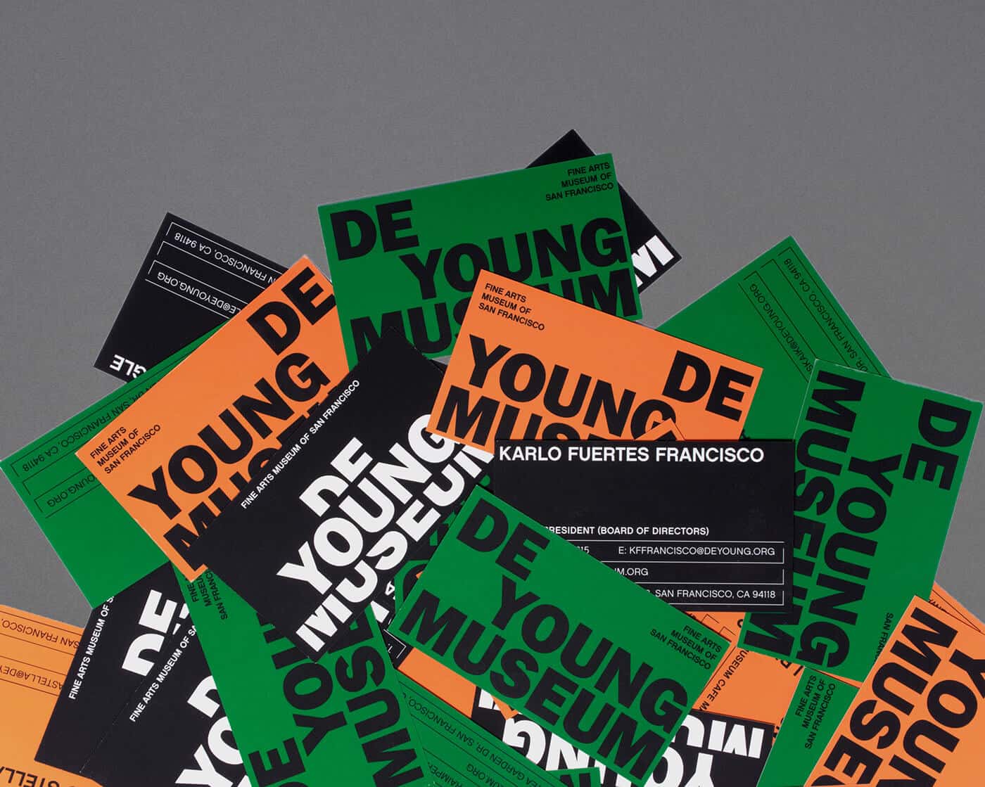
De Young Meseum
This bold Sans-Serif immediately catches your attention and looks disruptive and rebellious in a way that corresponds with a modern art museum. It’s becoming a recurring topic but the use of color is truly an element that you could consider when you’re designing your next business card and you want it to look modern.
Designed by: Karlo Fuertes Francisco
Hugh McCarthy
A minimal way of using typography and design entirely by carefully placing the essential information on your card, without any unnecessary and distracting elements. The hard part is to be strict and keep any additional elements outside your design as it is so tempting to add a small illustration or icon. But when you do, the card gets a sense of exclusivity and a high-end feel. You probably assume this business has something expensive to offer right? That’s what minimalistic design can do. Less elements could tell more.
Designed by: Both Studio
Fuel Bar
This extended typeface is another great example of popular design trends at the moment. Variable fonts are becoming more and more popular and even with variable webfonts popping up on a growing amount of websites, this type trend will probably last a long time. And we’re all for it! To balance your card you should consider creating contrast with a typeface that’s clearly different from your heading typeface. A regular sans-serif that’s legible when used on a small scale works great on this card and sets the heading apart at the same time.
The most creative part of this card is without a doubt the visual of the matches being placed in a way that the card seems to be an actual match box. Great piece of design.
Designed by: Gabriela Hernandez
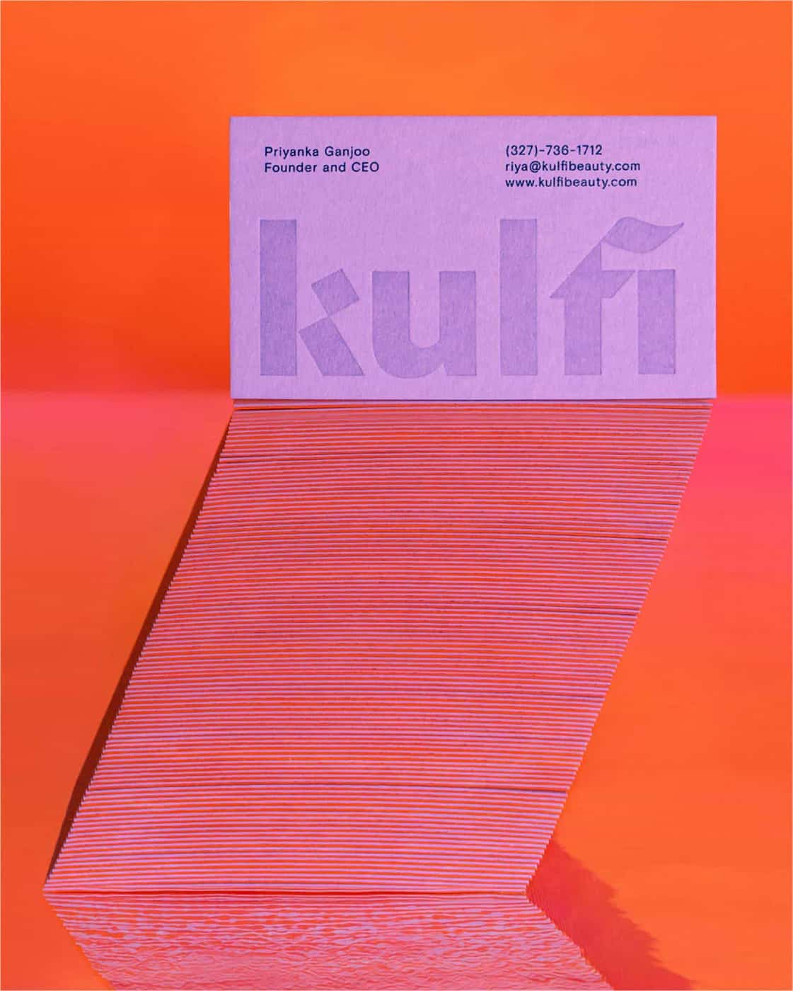
Kulfi
This modern looking combination between a Sans-Serif and a Blackletter is enough to create an interesting business on its own. These hybrid font styles are something more and more type designers are experimenting with and we like it a lot. Again, clever use of contrast by using a very legible and modern looking sans serif for the body text.
Designed by: Badal Patel
BBDO SF
Making small adjustments to an existing font can result in a good looking logo while keeping it fully typographic. The contrast in color really lets the logo pop and a clever way using the black body text to add depth to the design and creating a better looking business card in the end. For a logo like this bold or black font weights often work best to make the final letterforms be more interesting to look at.
Designed by: Play Studio
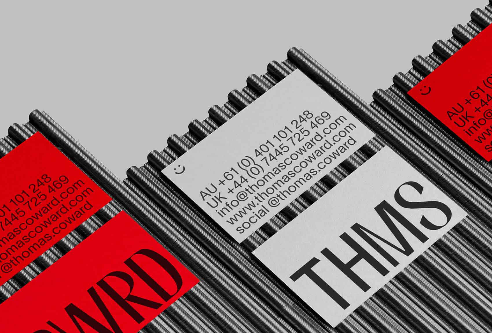
Thomas Coward
The high-contrast sans-serif font used in the logo is interesting enough to use at large scale. This way the letterforms are getting all the attention and you’ll notice these small, odd edits to the letters. On the back we see a popular, modern way to work with smaller text and looks rebellious in a way as it doesn’t follow the conventional rules when it comes to the amount of leading between the lines of text. Overall a very good looking business card.
Designed by: Studio SPGD
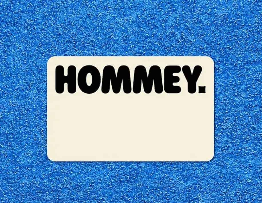
Hommey
Without knowing what the back has to offer you can immediately sense that this brand wants to come appear as positive and approachable. Clever use of the rounded edges of the card as well to complement the typography.
Really like the small detail in the ‘dot’ as it’s a pillow business and instead of the circular dot you probably would expect looking at the typography, they chose to work with a small visualization of a pillow that creates some contrast on this side of the business card as well.
Designed by: A Friend of Mine
Curri
Based on the font choice you can immediately sense that this is a technical business. Turns out Curri is a logistics platform so that message has been successfully conveyed by the designer. We’ve seen a lot of display typefaces so far and this semi expanded weight is definitely a great choice to use at a larger scale. Some designers use these typefaces for body text as well what’s not something we would advice but for smaller headers and subheaders they definitely set a vibe.
Designed by: WMB&Co.
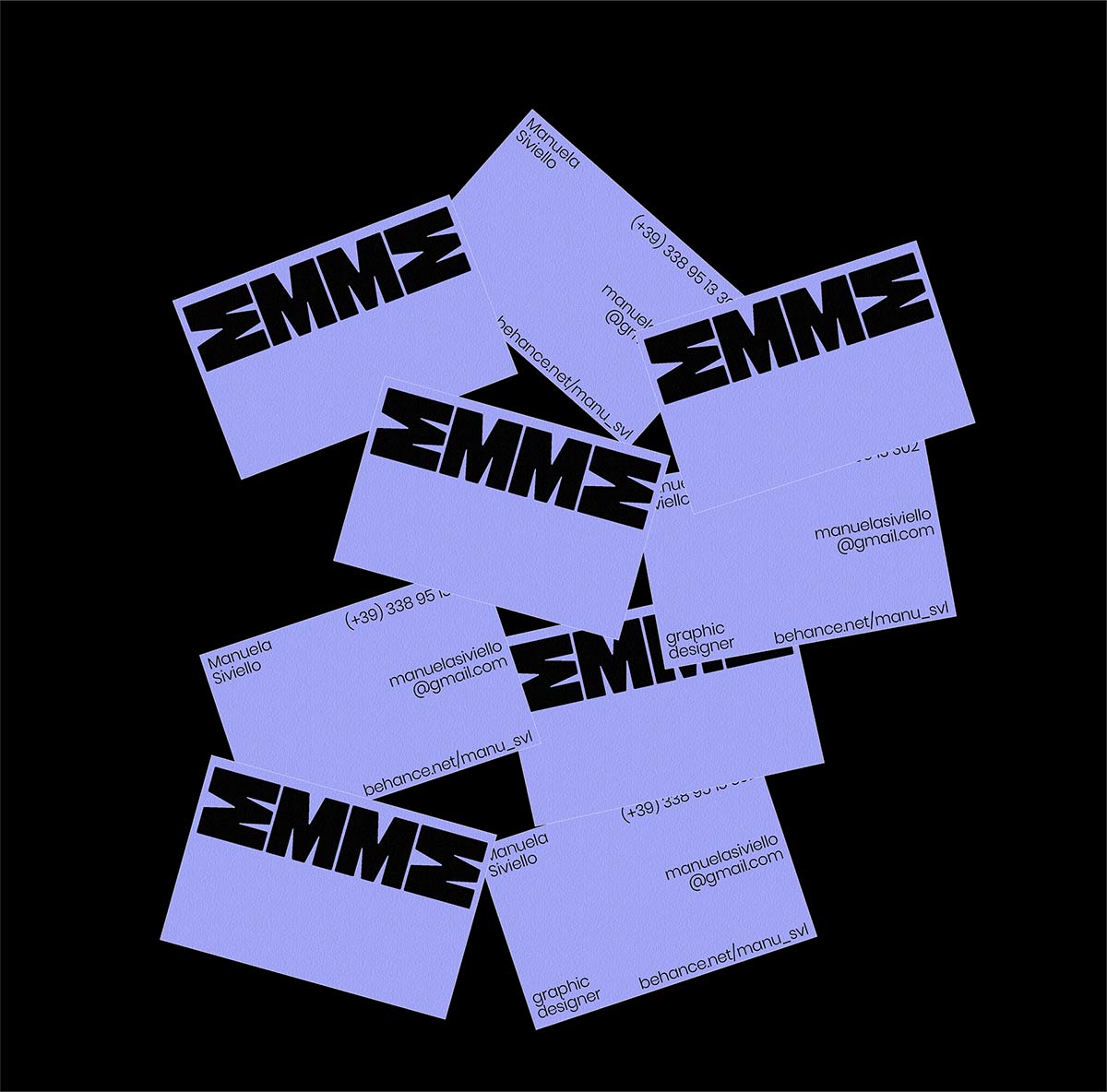
EMME
This solid typeface works perfectly for the brand’s name and instead of using the ‘E’ they rotated the ‘M’ to create a custom mark with ease. Combining the heavy display typeface with a grotesque body font, this business card definitely has some modern industrial influence to it.
Designed by: Manuela Siviello
Oke
Pushing boundaries what’s possible in typography to stay on the edge of legibility and abstractness. Sharp edges combined with rounded corners and overdone contrast elements, this piece of type is something you don’t come across very often and will leave an impression for sure.
Designed by: Thought & Found
Chief
First of all, we notice a clever way of working from the ‘C’ in the logo which creates an interesting visual element to fill up the entire frontside of the business card. On the backside, a large text with the employer's name set in a nice Hairline Serif that grabs your attention. To bring back the balance the smaller contact info is set in a modern sans-serif typeface.
Designed by: Mucca Design & Sean O’Connor
Alessandro Pigoni
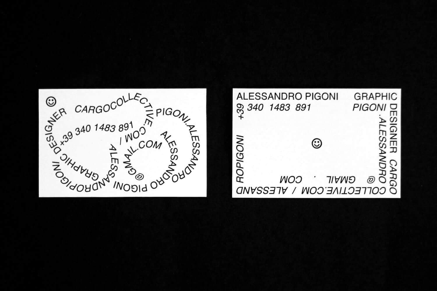
We’ve seen some examples so far of creative ways to use your text differently but this piece of personal branding from Allesandro Pigoni is truly something else. This black and white trend is something we see gaining popularity and it for sure has some artistic and Y2k aesthetics to it.
The rebranding project of the Stedelijk Museum from 2012 by Mevis & van Deursen got a lot of backlash from the design community at the time but we see that trend becoming more and more popular nowadays.
Designed by: Alessandro Pigoni
Salesloft
The Bracketed Serif trend is something we’ve seen being used a lot in brand identities for different startups and established brands around the world. This gives it a professional and trustworthy brand and when the kerning is set to -30 it suddenly becomes far more approachable and human. The painted edges on the business cards really adds a lot to the overall aesthetic and brings it to the next level.
The font on the backside used for the employer’s name reminds me of ABC Arizona from Dinamo. This is the first ever sans to serif ‘superfamily’ that slowly transitions from a sans-serif to a serif with all its interesting hybrid combinations between them.
Designed by: Focuslab
Odele
The lowercase display typeface used on the frontside is enough to fill up the entire frontside of the business card and with interesting shapes like this you don’t need anything else.
That ‘g’ and ‘k’ have some truly unique shapes and you can even build an entire identity based on these quirky bends and shapes. On the backside we see another uppercase display font that won’t remain very legible at a smaller scale but in this size if fits great in the overall design.
Designed by: Ira Arturawna
Nguyen Huy Hung (Key)
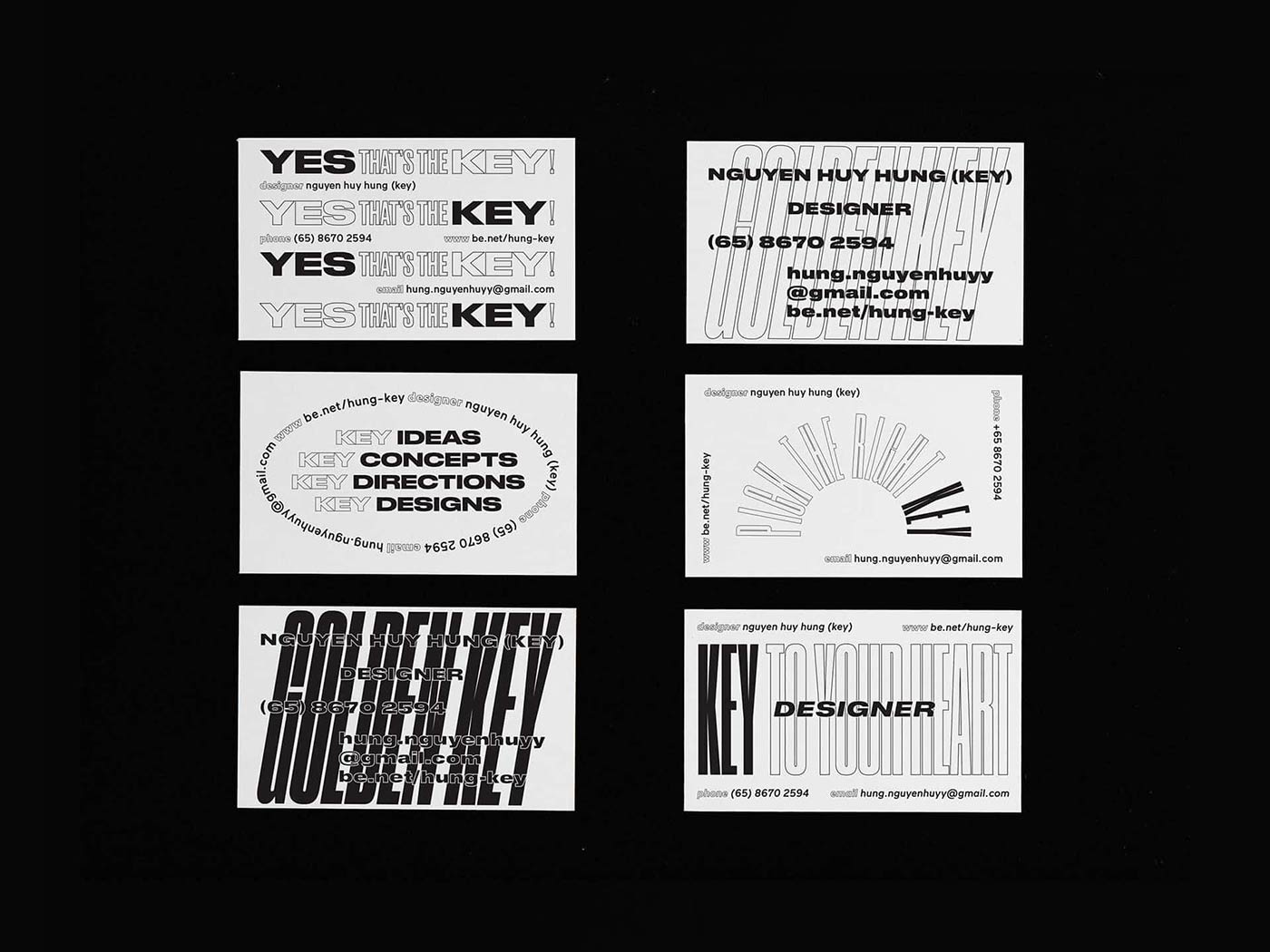
A different approach to typographic design by using typography to design the complete business card. Warping, bending, skewing, rotating. Whatever it takes to create interesting compositions and this results in a card you will be looking a bit longer for sure whenever this lands in your hand.
Designed by: Hùng Key
Appart Agency
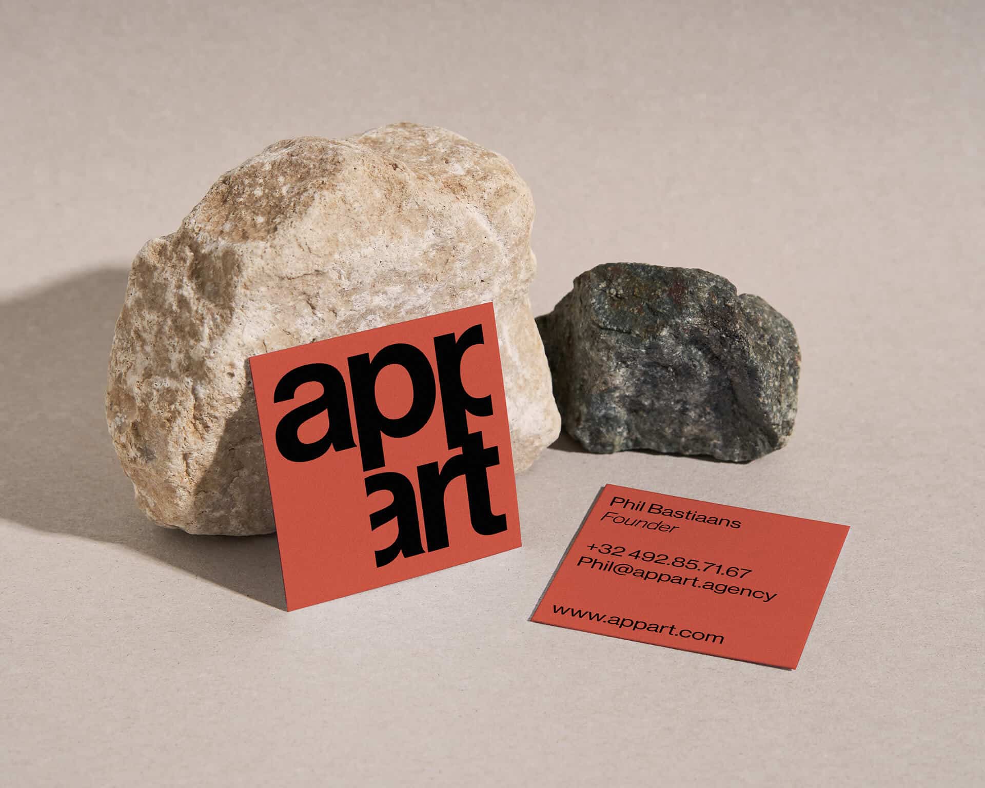
Adjusting the shape of your card based on the contents is for sure something you should consider when working on your next business cards. Because the end result of this business card is so much better than it would have been if both sides of the logo had still a lot of canvas, right?
The bold Sans-Serif set in lowercase is designed very well and aligns perfectly to each other. Cropping your text isn’t something you see very often but when it’s still legible this can definitely add a lot to your design.
Designed by: Antonio Calvino
Heba Shaikh
Expanding different letters in your design can be a brand identity system on its own that gives your brand a unique and custom aesthetic. Not every letter is simple to extend so you’ll need to experiment on this and see what’s possible once you made your font choice. This condensed Sans-Serif typeface works great to do this as it adds even more contrast to it in terms of width. The analogous color palette keeps it light and fresh to avoid it becoming too crowded.
Designed by: Antonio Calvino
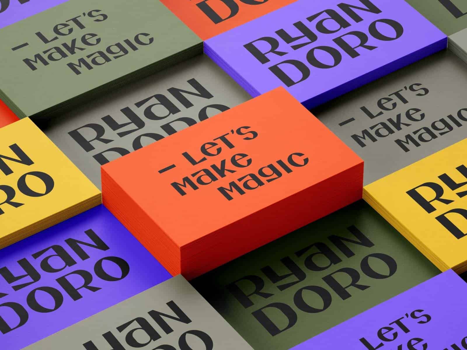
Ryan Doro
Looking at the absence of contact details this is probably just a mockup but it gives a sense of what’s possible with the use of this typeface. The flare-like serif font is something you don’t see very often and this combined with the lovely color palette results in a business card that grabs your attention.
Designed by: Ryan Doro
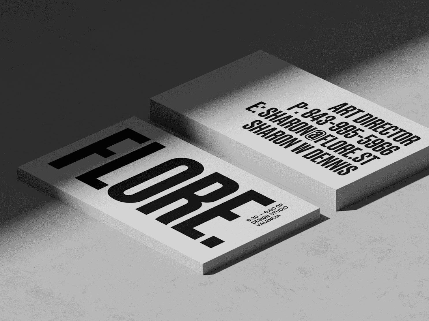
Flore
Condensed Sans-Serif fonts like Bebas Neue and Trade Gothic are all the rage for many years now and this business card is just another example why. Place some black text set in a condensed sans-serif on a white background and you won’t be disappointed with the result. It just looks good and will stand the test of time.
Designed by: Tobias van Schneider
Rockit
The first thing we notice is the combination of a geometric, rectangular ‘R’ and a display sans-serif in the rest of the logomark. It’s definitely a brave move and in this logo it just works. Combining this with a minimal sans-serif on the backside brings it in balance and results in a solid looking business card. Red, black and white is also a color palette that works very good for this technical looking brand.
Designed by: Andstudio
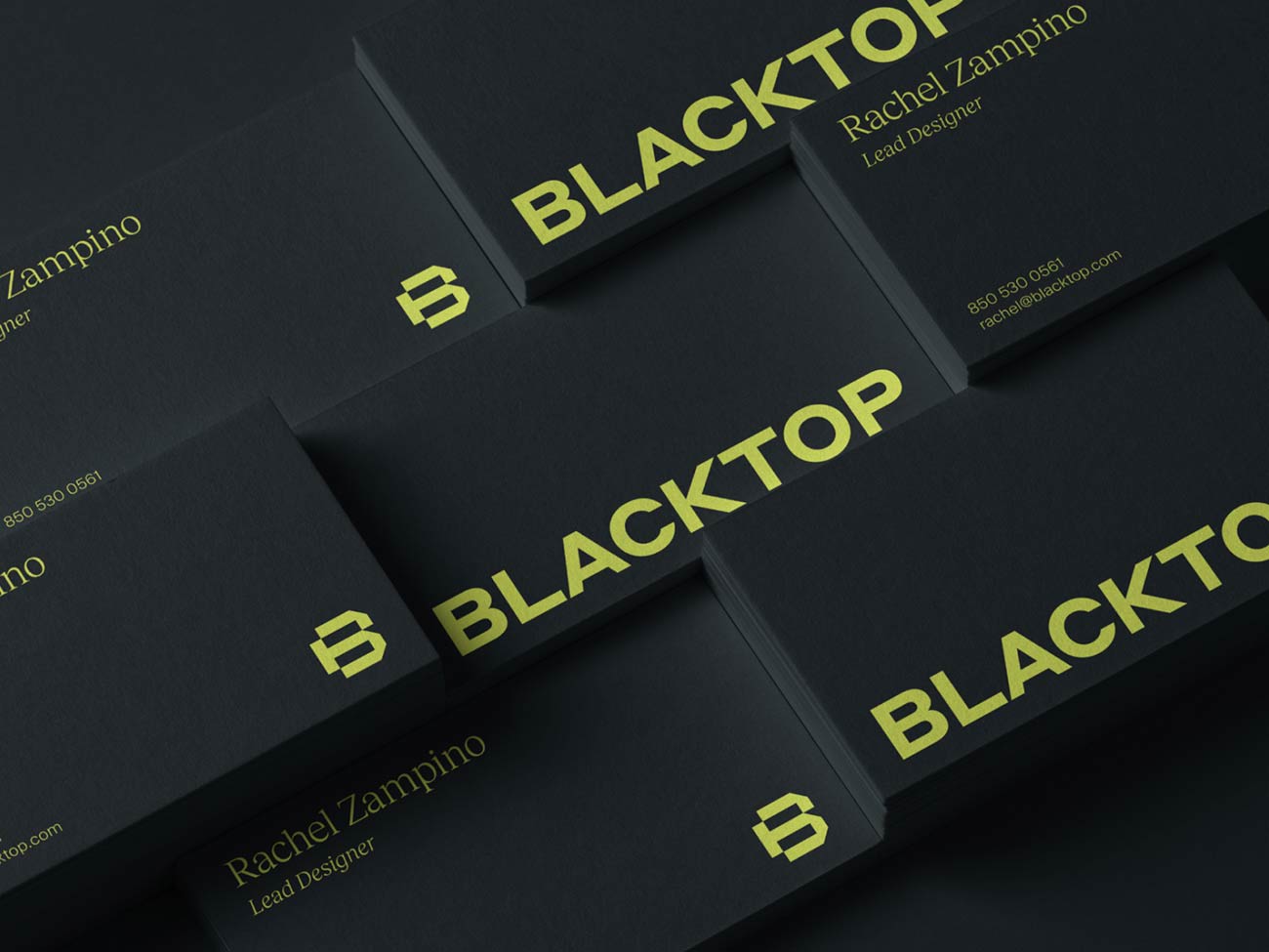
Blacktop
Just a bright yellow semi expanded Sans-Serif placed at the bottom of a black canvas. That’s all you need sometimes to create a great looking front side of your business card. As designers we tend to over complicate this process because there are so many options out there to add to your design, right? But most of the time it’s about leaving stuff out to really let your design stand out.
I think a big part of this process comes from the fact that most designers are criticized by clients and non-designers by delivering a design that doesn’t have a lot of elements in it. ‘Are they paying you for this?’ Questions like that. And as I have discussed this topic with many designers over the years I’m pretty sure this has been an important factor for them to keep adding elements to make it more complex or ‘worthy’. But let’s celebrate the simplicity of leaving stuff out, it will do your design good.
Designed by: Jared Granger
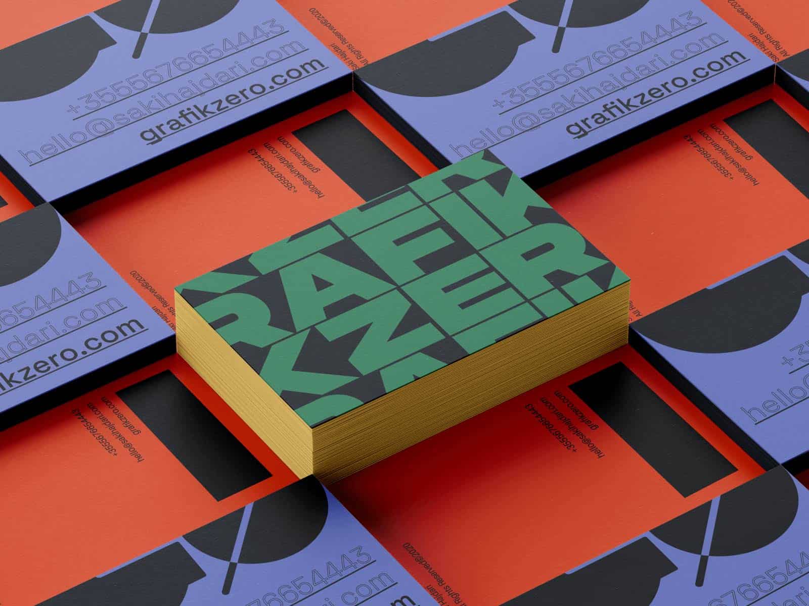
Grafik Zero
Another extended typeface that’s used to fill up the frontside completely. The brand’s name ‘Grafik Zero’ isn’t legible in the repetitive lines of text but this doesn’t always need to be if somewhere else on the card it’s being communicated clearly what the brand’s info is. The combination of a bold display font, a sans-serif body typeface, the color palette, painted edges, it just works.
Designed by: Saki Hajdari
Shile
Another extended typeface that’s used to fill up the frontside completely. The brand’s name ‘Grafik Zero’ isn’t legible in the
Extended typefaces are gaining popularity and here’s another one that on itself can communicate the overall look and feel of a brand. Adding those small lines of text on the frontside add so much depth that makes the design even more interesting to look at.
Fixture by Sudtipos is a great example of a font family you gives you plenty of options to accomplish an aesthetic like this.
Designed by: Outer Studio
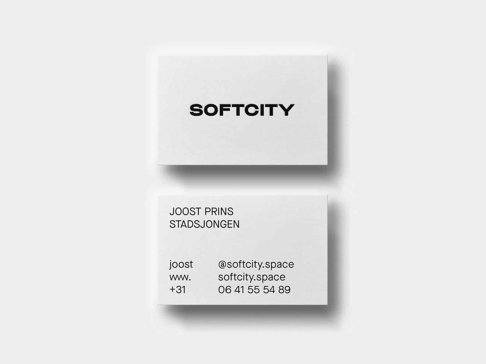
Softcity
Could it be all so simple? Just a great looking semi extended Sans-Serif placed in the center of a white textured canvas. On the back there’s another Sans-Serif being used for the contact info and it just works.
Designed by: Met Studio
Planta
A great example of a portrait business card and how to properly place your logomark, wordmark and other elements on it. The flower-like mark could even be made from a Blackletter ‘W’ and the modern sans serif with a geometric touch works great for the wordmark and plays along well with the floral icon.
Designed by: Mr. Mockup
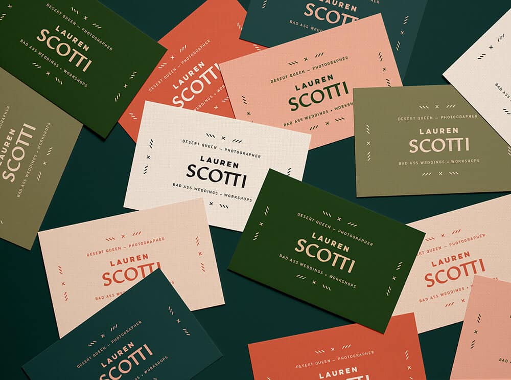
Lauren Scotti
These business cards look great when they’re together. There’s something about the color system that just works seamlessly with that modern, blackletter looking typeface.
Designed by: Lindsey Pruitt
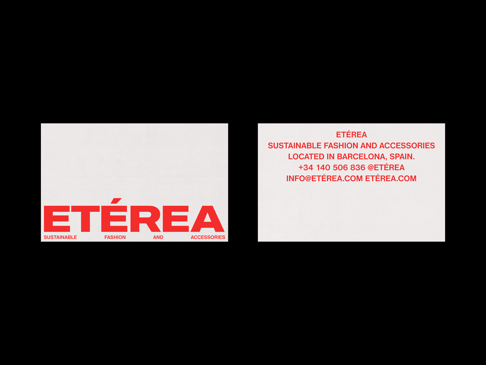
Eterea
Another extended typeface that sets the tone in a bold and solid manner. The backside is straight to the point and just tells you immediately what you need to know using a modern grotesque typeface. Red on white is always a great attention grabber and this business card is definitely not an exception to that.
Designed by: Cameron Hall
Okay
Dynamic font systems is something we’ve seen a lot lately in brand identity systems and when executed well, this can become a great asset to your brand identity. These cards show different font options but could all be used properly for the same brand. In all three variations we can see typography does so much for your design and you won’t necessarily need anything else to complete it.
Designed by: Mr. Mockup
Marie Mur
Definitely an interesting combination of font choices. With the sunbeam-ish visual being the only non-typographic element on these cards we can spot 3 different typefaces and they all fit their purpose perfectly. It’s not a surprise anymore that we see business cards with solely black ink for the text layer but it just works.
Designed by: Irina Nakonechnaya
Bolinaria
Another great example of a good font combination on these elegant business cards. Using an Idealist Serif for the ‘Bolinaria’ part gives it a Botanic vibe immediately and without any unnecessary elements these simple business cards just convey the message and give a taste of what the brand is all about.
Designed by: Irina Nakonechnaya
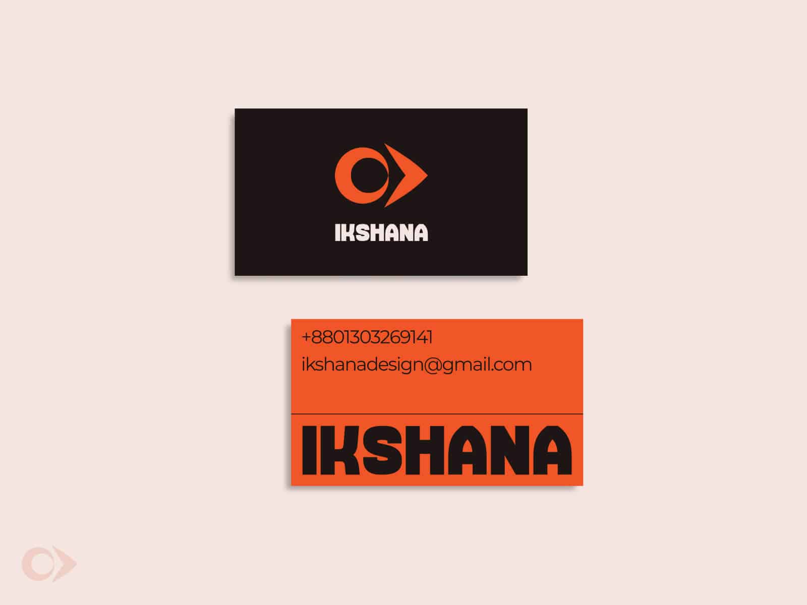
Ikshana
Solid, simplistic design. This was definitely the direction of the designer during this project. The ultra bold/black typeface for the brand’s name is supported very well by a minimal sans serif. Black, orange and white always play well and give it a strong mechanical look to it.
Designed by: Sazzad Hosen
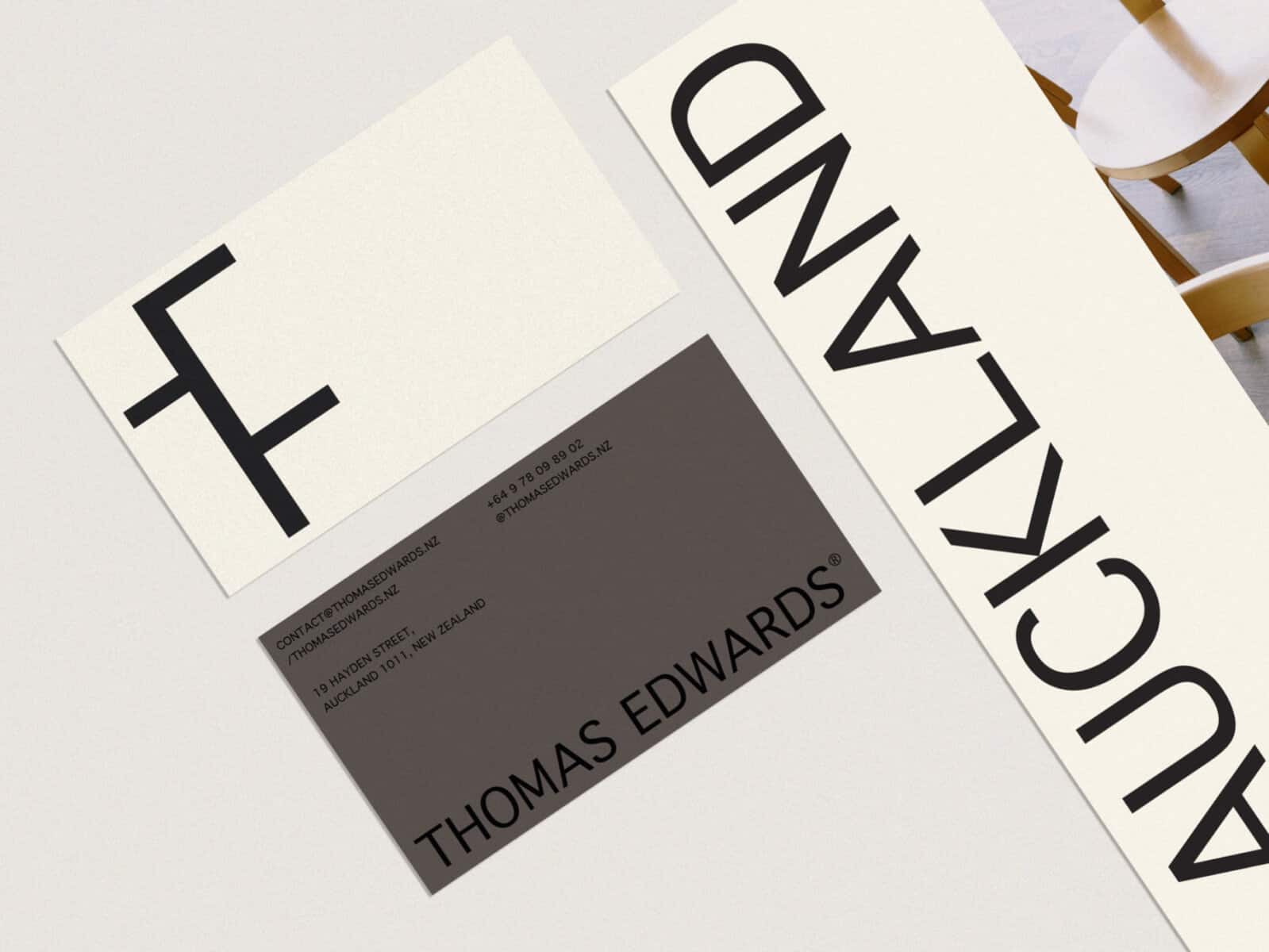
Thomas Edwards
Using certain parts of letters will give you unexpected results in many ways. Whenever it makes sense during a project, consider experimenting with different parts of a typeface to see if there are any interesting ways to use typography in your design. These business cards are very minimal and still look very thought out by the designer.
Designed by: Kate Zest Studio
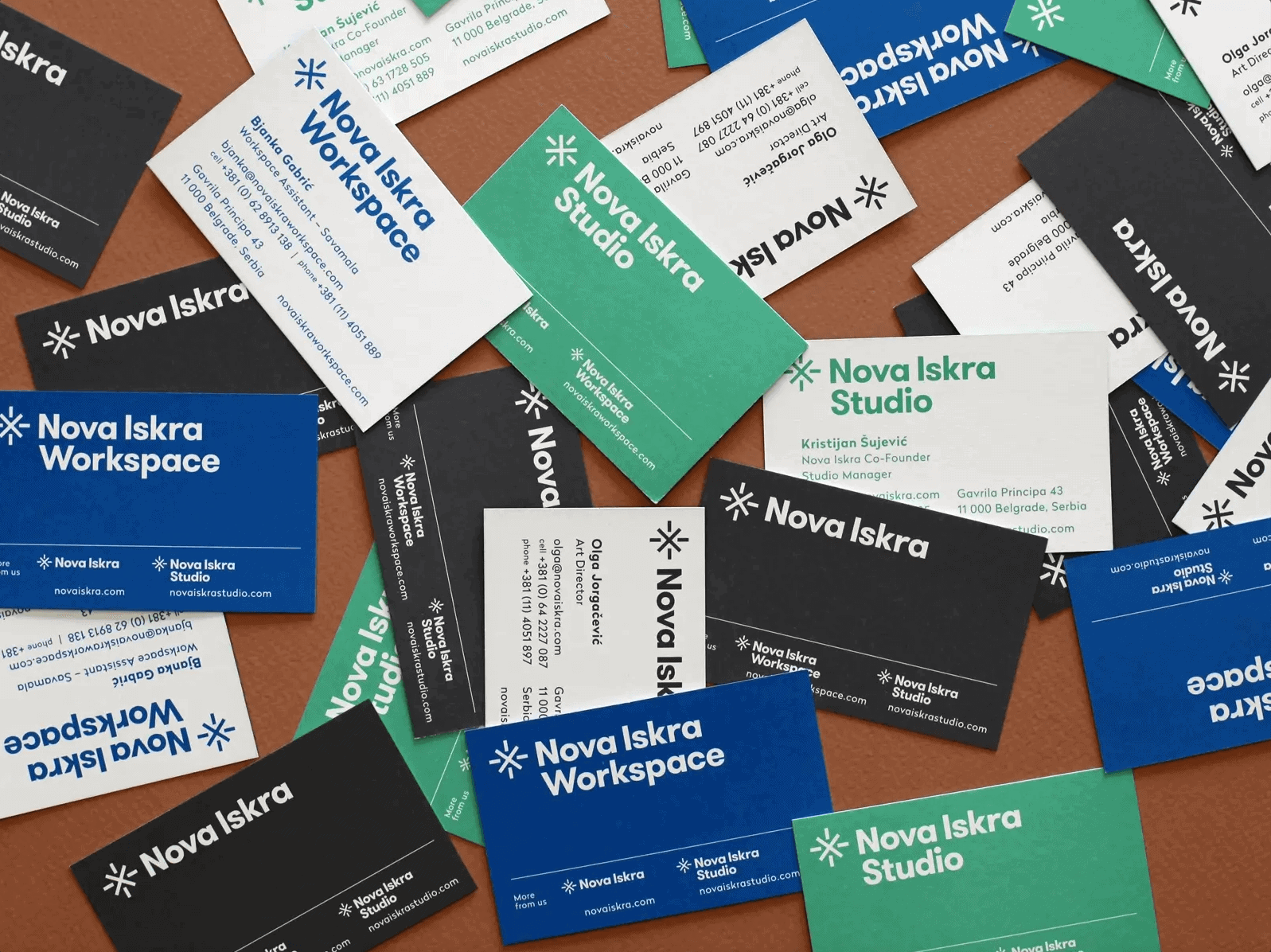
Nova Iskra
The bold sans serif font used on these cards work very well at a large size as on smaller texts like the contact info. This makes it possible to use one typeface across your entire brand. In case you’re considering this make sure your typeface of choice has enough weights in its font family to have a wide range of possibilities.
Designed by: Olga Vajagić
Woven
When you select your typefaces wisely, a wordmark becomes interesting enough to place on one side of your card and grab someone’s attention with it. Although it looks like this rounded serif typeface has been modified a bit in the ‘e’, it just looks great and conveys the message of a positive, fun brand.
Designed by: Alen Pavlovic
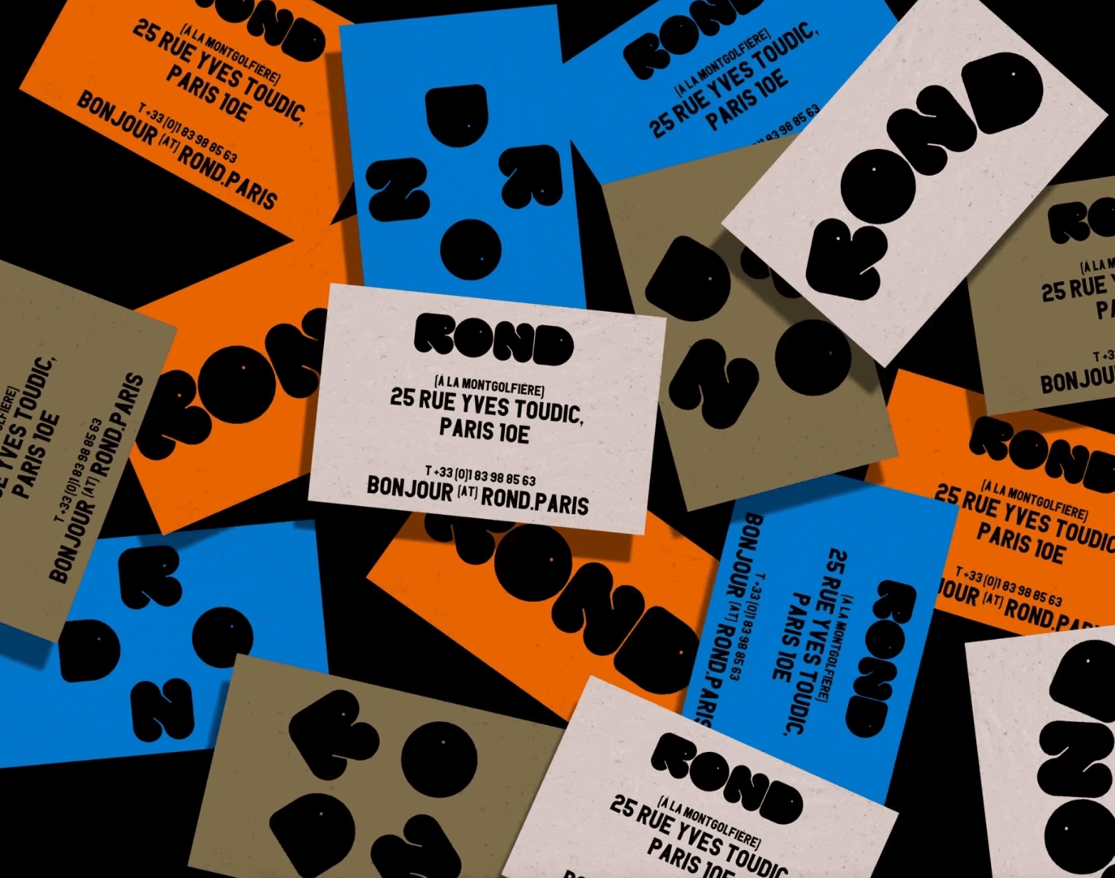
Rond
Truly a lovely piece of design made by the Paris based design studio Brand Brothers, using a ultra black display typeface designed by themselves. Adding an industrial condensed sans serif typeface to it adds a lot of contrast and gives it a restaurant look as well. Definitely worth your time to have a quick look the complete branding project.
Designed by: Brand Brothers
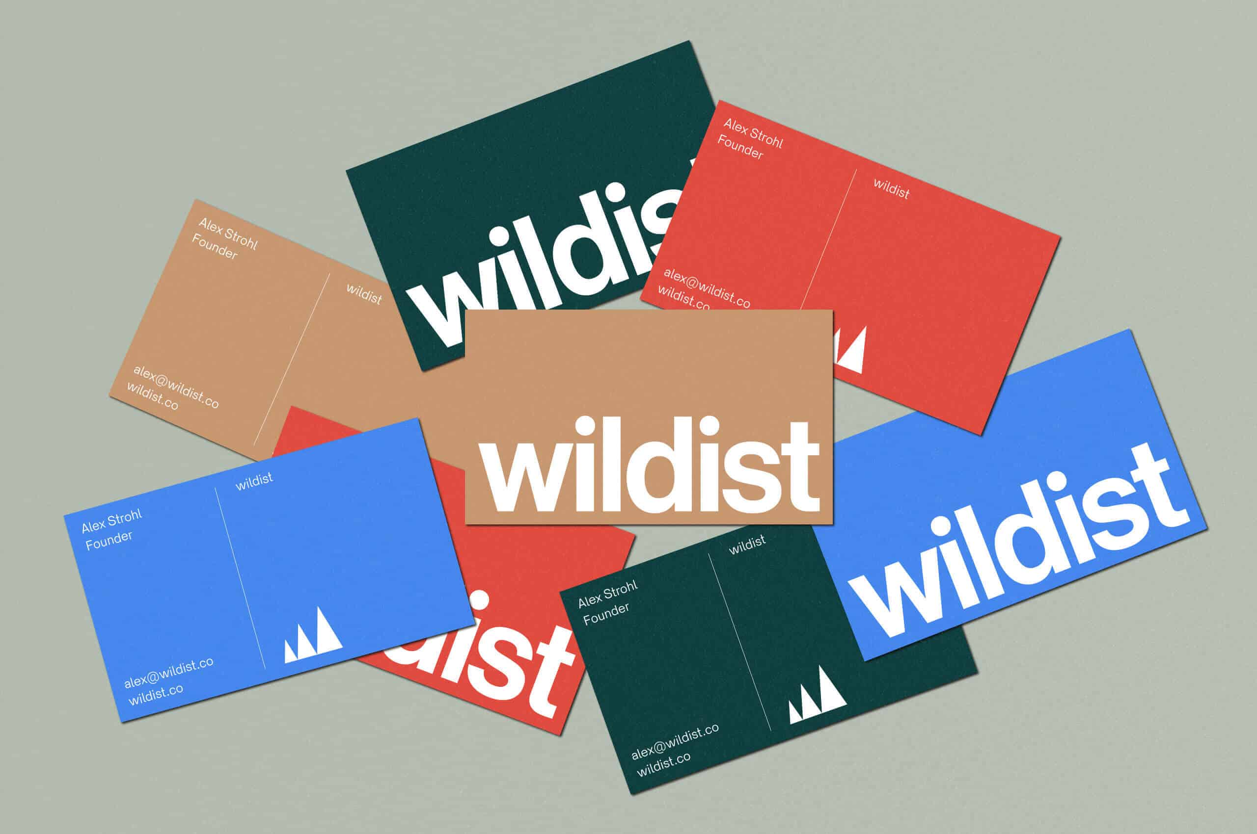
Wildist
This use of a grotesque typeface with tight kerning shows how quickly you can create a certain look when all used elements complement each other well. The color palette, typography, mountain icon and even that small border all comes together great and results in a business card that will stand out.
Designed by: Studio Mast
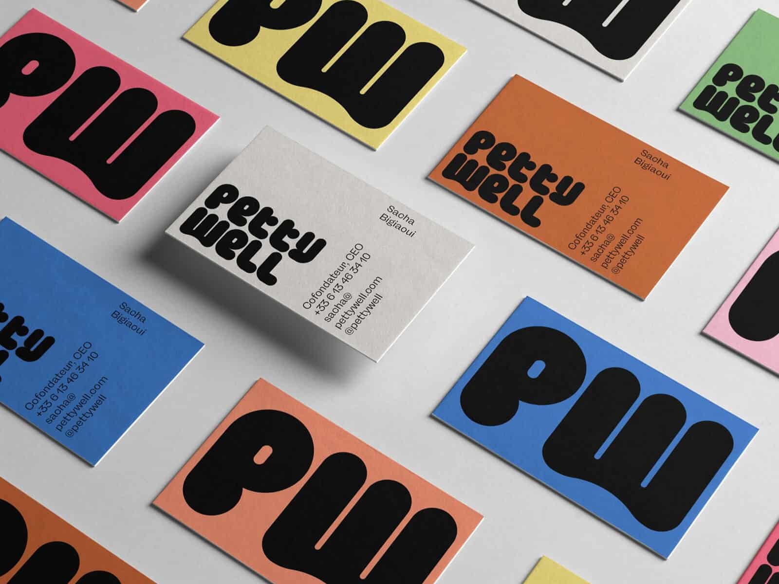
Petty Well
We’re big fans of expressive fonts and it’s amazing to see how well that ‘PW’ works when placed full size on the front side of the business card. These letterforms aren’t something you see very often and whenever you’re looking for a display font, consider looking at those kinds of characteristics that will add so much value whenever you’re using it. Again, this needs to be supported by a more legible typeface for body text so keep this in mind when you’re using heavy display fonts.
Designed by: Mr. Mockup
There you have it! 54 typographic business cards in all styles and shapes. Hopefully you came across some cards that sparked your inspiration for that next project.
With these cards, font choice is everything. Swap one of these great fonts with a dull looking option and your card just became a lot less appealing to the eye. Working with contrast works great as well. So in case you’re working with a very bold font in your larger text pieces, try a thinner one for your smaller text to add some depth to your design and make the overall card far more interesting to look at.
Next to the difference in weight, adding contrast in size works very well also. So try to vary your text sizes based on the hierarchy of them. So decide what’s the most important text element and reduce your font sizes from there.
So, where do I find that perfect font for my next project? Depending on your budget, you have many options to choose from. To help you out, we have summed up some of our favorite free marketplaces and premium foundries at the moment.
Some free font marketplaces:
- Google Fonts
- Adobe Fonts (free if you have a Creative Cloud account)
- Font Squirrel
Some of our favorite type foundries:
Ready to start your next business card project? Over here at Jukebox we’re loved for the amount of options we have to offer when it comes to the material options. Wooden, Cork, Cotton, Triplex, Pulp, Kraft, Spot UV, Silk Matte and many many more.
Have a look at all our Business Card options and whenever you have a question, let us know and our Support Team would love to help you out.
